Fab Twaggies
A clever combination: Twitticisms + great illustration = Twags. From Kiersten Essenpreis at Twaggies.
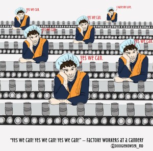

A clever combination: Twitticisms + great illustration = Twags. From Kiersten Essenpreis at Twaggies.

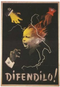
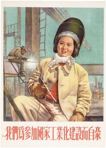 I’ve been a fan of propaganda art for years and have the beginnings of a poster collection that one day will require its own mini museum. Aesthetically, the combination of knock-out design, typography and (much-mimicked) text just enthralls.
A rather heated debate today with design friends resulted in my conceding to the view that a copywriter isn’t always necessary. I should point out that I was outnumbered by five to one for the entire duration of the debate and we were only talking about magazine ads. However, I’ve been presented with some great proof which, despite the obvious career suicide, I’m happy to share.
Quote of the day from the hugely talented Rich McCoy:
“I think the whole world needs copywriters. The more I work with them, the more important I think they are in the mix.”
Perfect.
Rich’s quote is an extract from a brief online exchange we had earlier today about Saatchi. Saatchi and his quite gob-smackingly incomprehensible British Art Now catalogue. I shan’t sully this post with the details. It really needs separate treatment. Which I’m going to give it in just a minute. In the mean time, here’s that quote again:
“I think the whole world needs copywriters. The more I work with them, the more important I think they are in the mix.”
Did you get that?
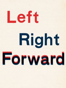 With only a week to go, this is just irresistible. Jonathan Jones introduces a feature in today’s Culture Guardian showcasing alternative takes on the political campaign poster from some of Britain’s leading artists. You can see their work here plus more detailed commentary from each artist (and Jonathan’s introduction) here.
I agree with the article tone that official campaign offerings are more than unimpressive, but I’ve really enjoyed the unofficial and not so underground stuff like My David Cameron. If anyone can teach the big parties a thing or two about clear copy, it’s the creators of some of these gems.
Very early comments on the Guardian site suggest there is a big gap between fine art and graphic design when it comes to posters. My own take – unsurprisingly – is it comes down to the copy and the connection the copy has with the design. Hence my favourite of the lot is this one by Goshka Macuga. Clear, clever, totally connected to its purpose and comes with a back-story.
A busy few weeks in the Kate Starling copy room have kept me away from my blog for too long. *Imagine doleful, semi-troubled and slightly sheepish emoticon here. If only English punctuation could cut it.*
Anyway.
On the non-doleful side of things, I’ve got a stack of new stuff to share which I shall slowly nourish you with in the coming days. And even better than that… Net result of busy few weeks is a big Hello and Welcome to two new Kate Starling copy converts: Ferrier Pearce a rather lovely and talented bunch of designers from the South East and moving north: Beach Marketing an equally creative and technically clever team from Northampton.
Delighted to have them both on-board and looking forward to posting some of the results of our ventures on here.
Back sooner than I was last time.
I’ve just finished an enjoyable time working on copy for the new Wireworks site. Very cool stuff for kitchens and bathrooms and inspiring design from Lincoln Rivers. Loved it. Keep an eye out for the new site and follow the link coming soon in Finished Words.
There are times when only the original works.
I’ve been delighted to rediscover the iconic work of Alex Steinweiss and his brilliant album cover artwork.
Take a look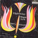
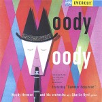 .
.